Invoice Passbook - Mission Mall Optimization
Project period
Role
Visual Design
UI & UX Design
Responsible for the project
Function process planning, design finalization, engineering delivery, user research
Responsible for products
Invoice Passbook App
02
Project Overview
01 Team Goals
The restructuring of the information architecture, screen interface, and processes to increase the exposure of key content and reduce the discontinuities in executing tasks and redeeming products.
02 Roles and Outputs
In this project, I worked closely with the product manager and three engineers, and I was responsible for the entire UI/UX design process and output. From defining the problem to delivering the final visual design to the engineering team, as well as conducting user interviews and producing reports for the B-side.
03 Project Challenge
Making hasty changes to the functional architecture may lead to user loss; moreover, the existing engineering structure is quite complex and there are many limitations to adjustments.
04 Project Outcomes and Impact
The project has entered the engineering development phase, and the effectiveness will be tracked later.
03
Project background
The invoice passbook is one of the most popular invoice prize apps among users in Taiwan, with over a million active users each month. However, the coin mall page, as a profit-oriented feature, has not undergone any fundamental optimization or adjustments in recent years.
Several surveys were conducted to gather user feedback, and the actual usage habits of users became increasingly clear. Data also revealed that the coin mall did not meet expectations in certain metrics. Therefore, to respond to the future needs of the app's business model, we will reorganize the existing functions and interfaces, and replan the interface functions based on pain points and business considerations.
04
Design process
01 Understand the problem and user pain points
By conducting a survey, we can understand the actual usage of the user and the problems encountered during the process.
02 Define the problem and objectives
Organize questionnaire feedback and converge on the goals of "solving the breakpoints in the closed loop of exchanging coins for products" and "exposing important information".
03 Idea Solution
Propose optimization solutions for the breakpoints that occur during User's process of collecting coins and redeeming rewards.
04 Experimental Validation of Ideas
After going live, track these three metrics: increase the task page views (PV), unique users per week (UU/week), and the click-through rate of total task exposure.
05
Understanding the Problem and
User Pain Points
In order to better understand the actual usage of users and their satisfaction and thoughts on various features. In August 2022, a "Main Function Questionnaire" was released within the app, collecting a total of 7,000 questionnaires, with 5,000 valid responses.

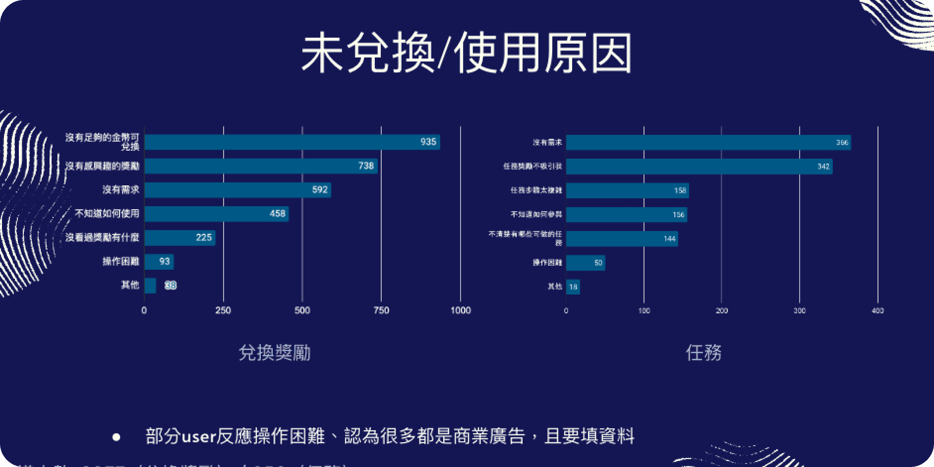
Preliminary observations suggest that there is a higher proportion of users who find the coin mall experience quite difficult. Further exploration shows that over 30% of users are unaware that there is a task mall feature within the app, and among those who know about the task mall, 30% have not redeemed any products due to insufficient coins. Feedback also included comments such as "I don't know what coins/in-coins are," "the steps for completing tasks are complicated and difficult to execute," and "I don’t know where to find redeemed products/ongoing tasks." Cross-analysis reveals that iOS users aged 45-65 and above have a lower overall NPS Score. Future interface design should consider the operating experience of older users (e.g., larger font experiences...); additionally, the redemption reward rate on Android is higher than on iOS, but participation in the coin task mall/performing tasks is lower; it is tentatively speculated that Android users are more easily attracted by rewards.
05
Define the problem
Through surveys, we learned that the task mall function is difficult for users to use. Issues such as unclear task guidance, inconsistent operation flows for some features, and unclear meanings of certain fields also affect the conversion rate of users completing tasks. After several internal team meetings focused on these issues, we set our goals in the following two directions:
From the questionnaire and backend, it can be observed that the audience for invoice savings accounts has a higher willingness to perform tasks and redeem products. However, due to multiple factors such as complex execution steps, untimely recognition mechanisms, and lower diversity of redeemable products, users are prone to drop off during the execution of tasks.
Increase important information exposure
Some features developed in the past for the task mall page have changed significantly in importance and usage scenarios as the app continues to evolve. Therefore, after the team decided to invest resources to adjust the task mall page, they also reorganized the information architecture. First, they simplified or removed less utilized information and readjusted the existing layout, aiming to expose more information without affecting the user experience.
06
Establish a hypothesis
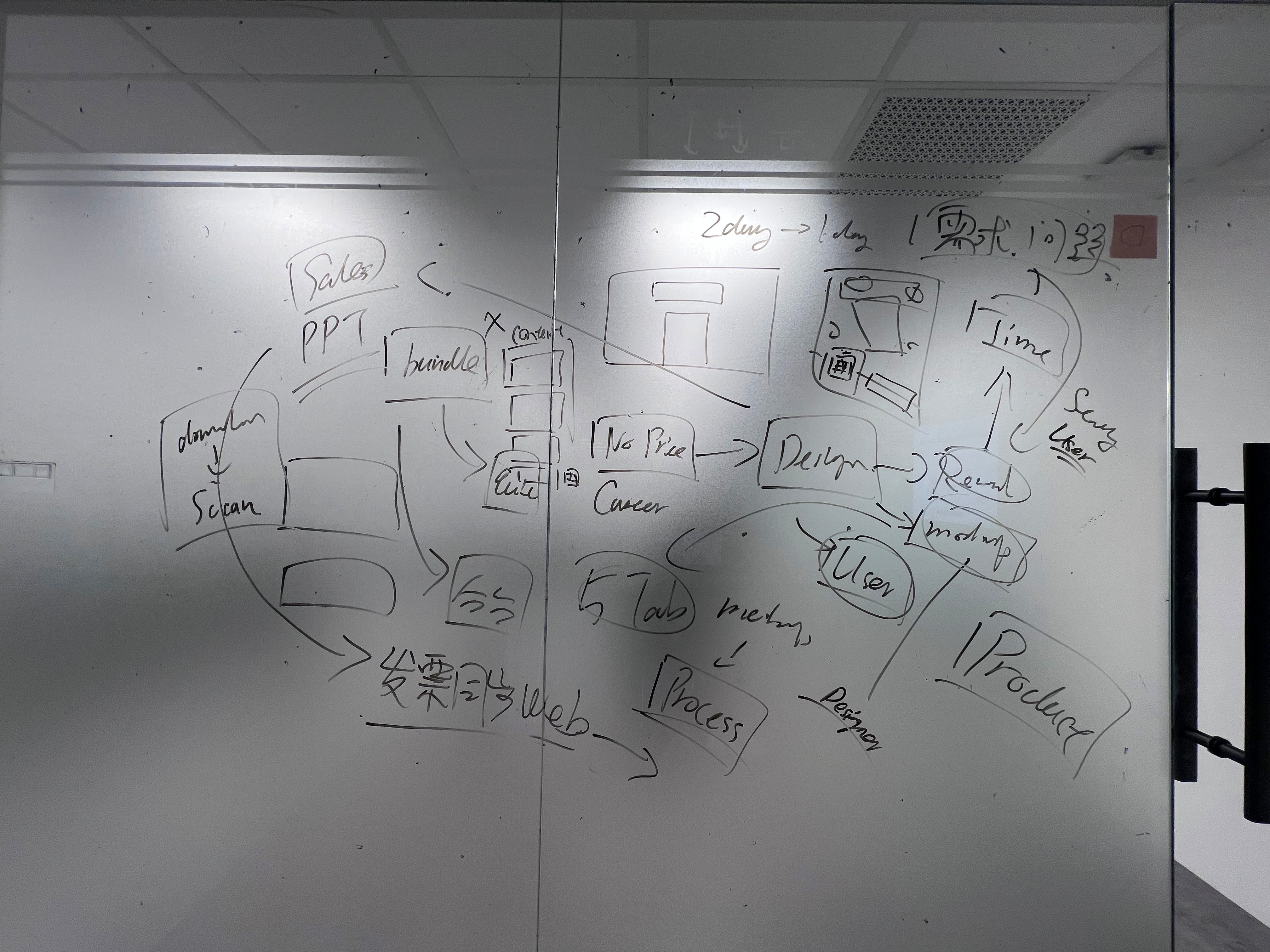
In order to achieve the three observation indicators of "increasing task page PV and UU/week exposure by 15% and improving the overall task click-through rate by 20%", and combining the two goals of "solving the breakpoints in the closed loop of currency exchange for goods" and "increasing the exposure of important information", the team adopted a Sprint approach to advance product development every two weeks, avoiding a large scope of product iteration that leads to distraction, and allowing for rapid validation of ideas and adjustment of direction.
Goals and Challenges
Our goal
Through the restructuring of the information architecture, interface, and processes on the task mall page, increase the exposure of task product content, rearrange the presentation of certain content, reduce the pain points in executing tasks and redeeming products, and observe specific indicators to verify the effectiveness of the revision.
Challenges and limitations
Due to the long-standing existing mechanism, users have developed habits, and rash changes to the functional structure may lead to user loss; furthermore, the existing engineering architecture is quite complex, and there are many limitations in the screen mechanism.
05
Design output
Here are the main features launched in the first version and subsequent optimizations:
First version launched
The primary task is to ensure that the task and mall pages can expose more important information, driving an overall increase in click-through rates.
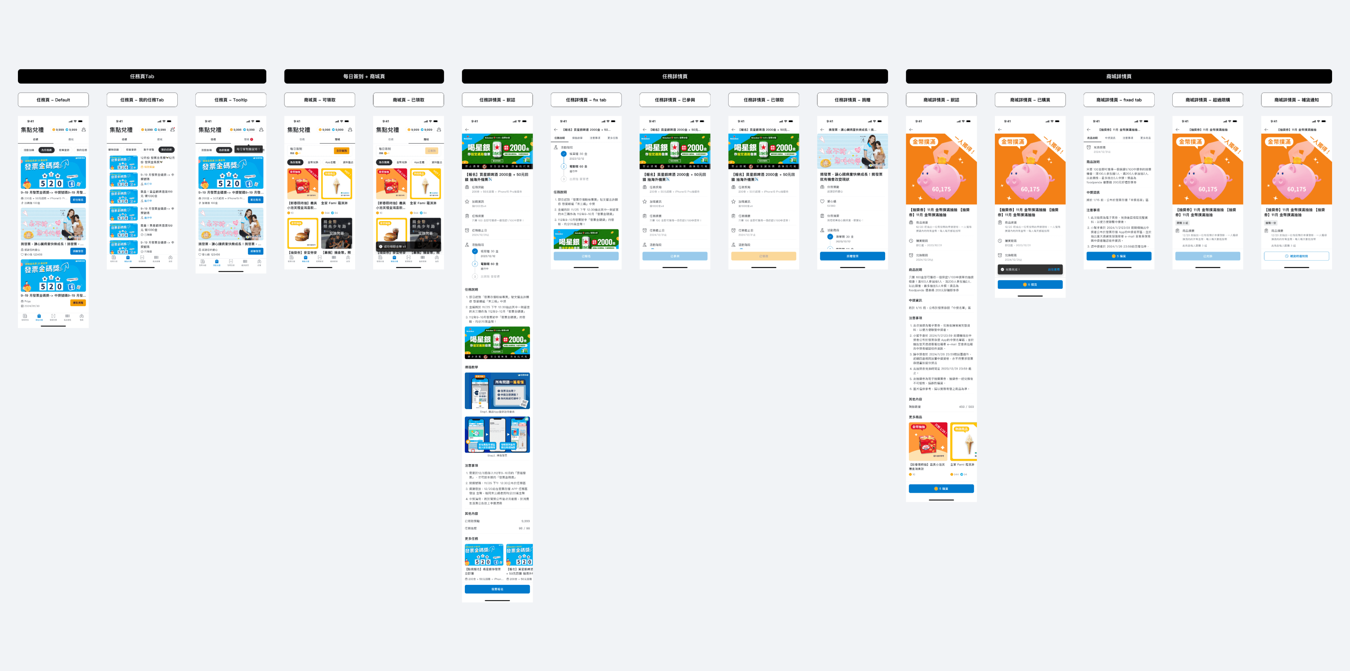
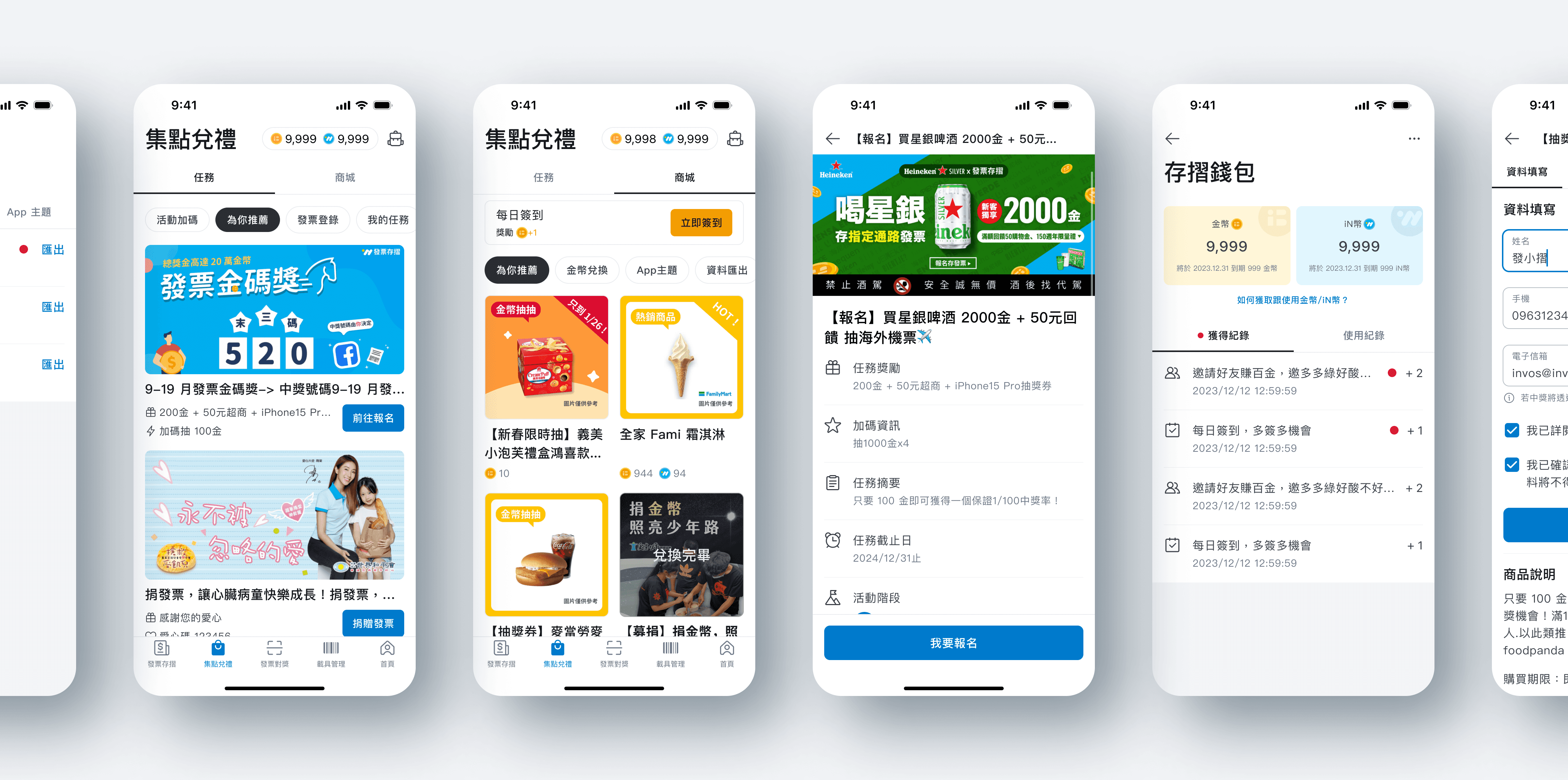
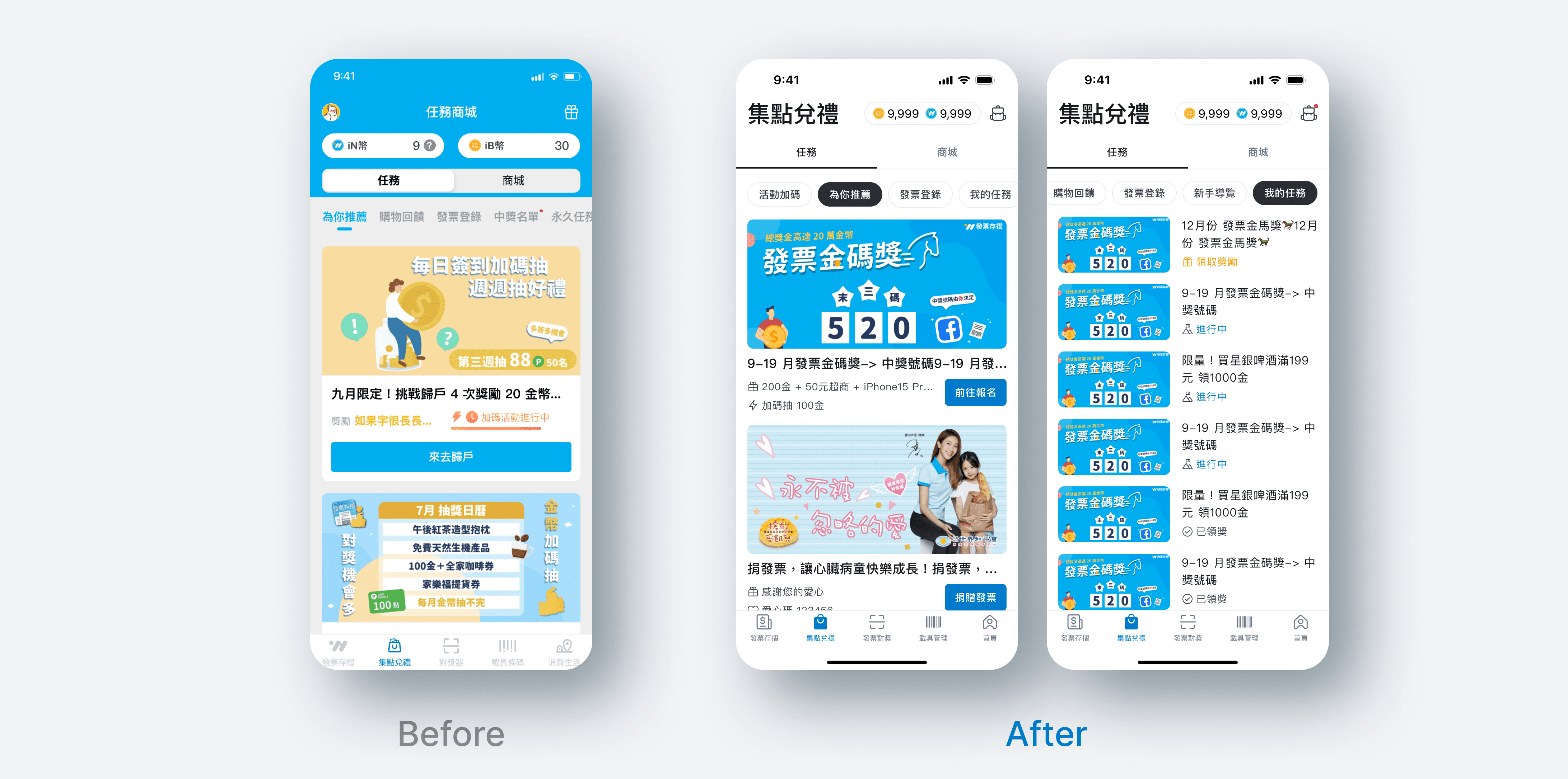
Task list page / structure adjustment
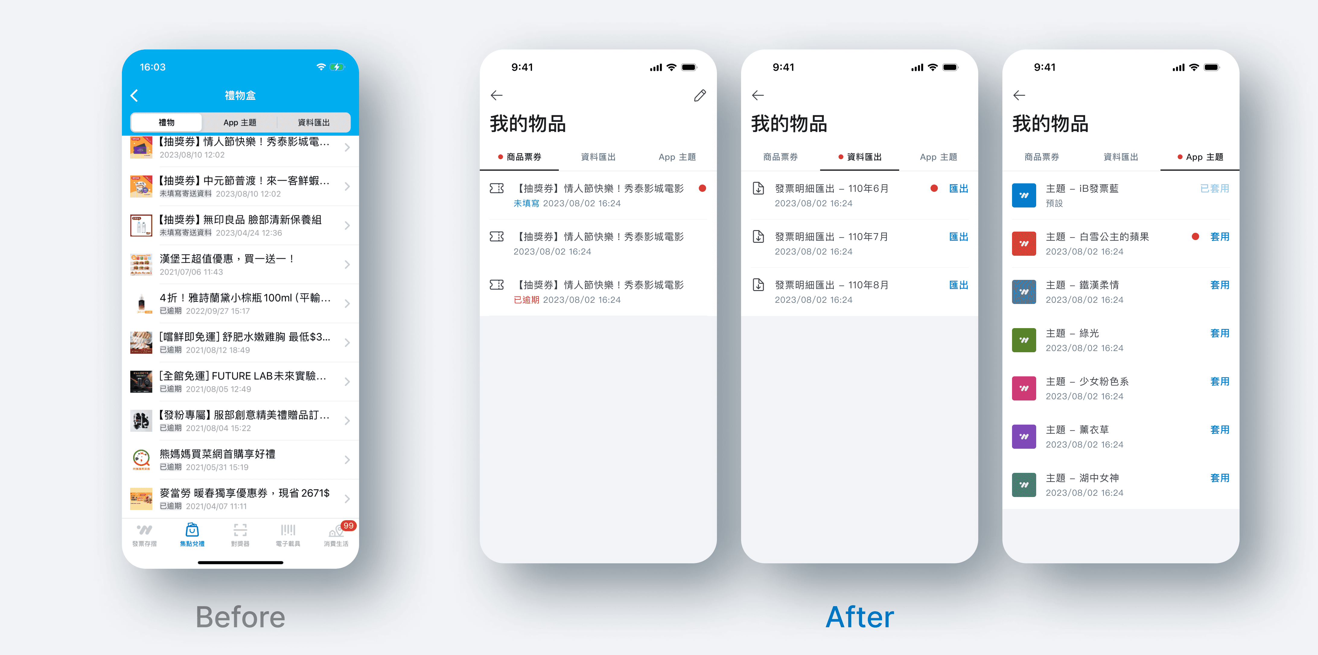
On the Navigation Bar, the coin section that originally occupied one column has been reduced to the top right corner; the ambiguously positioned gift box has been adjusted to a backpack icon, and its name changed to "My Items"; the layout of the task card has been adjusted, the button size reduced, a deadline added, and a "My Tasks" tag has been added for users to confirm the progress of ongoing tasks.
Task details page / Usability experience
The optimization of the task detail page reveals from questionnaire feedback that while the tasks still attract users, the complex execution steps and unclear instructional guidelines lead to users easily feeling frustrated and abandoning the tasks, or even giving negative feedback. Therefore, elements such as 'task summaries, illustrated task descriptions, and invoice recognition tutorials' that help users understand or execute the tasks have been added to the detail page. Additionally, a Segmented Control has been introduced to provide quick switching between content sections, to prevent users from getting lost due to excessive browsing time.

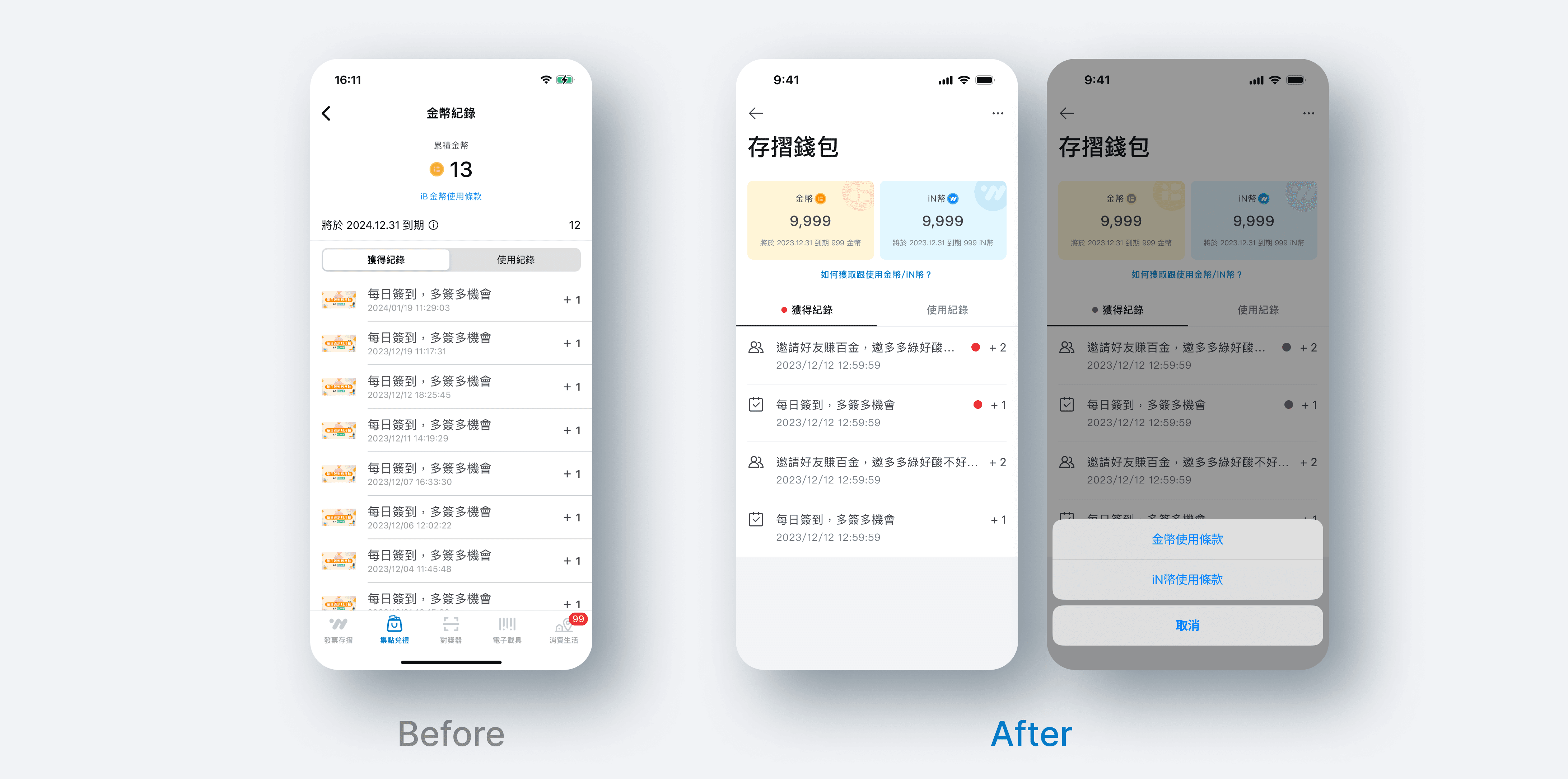
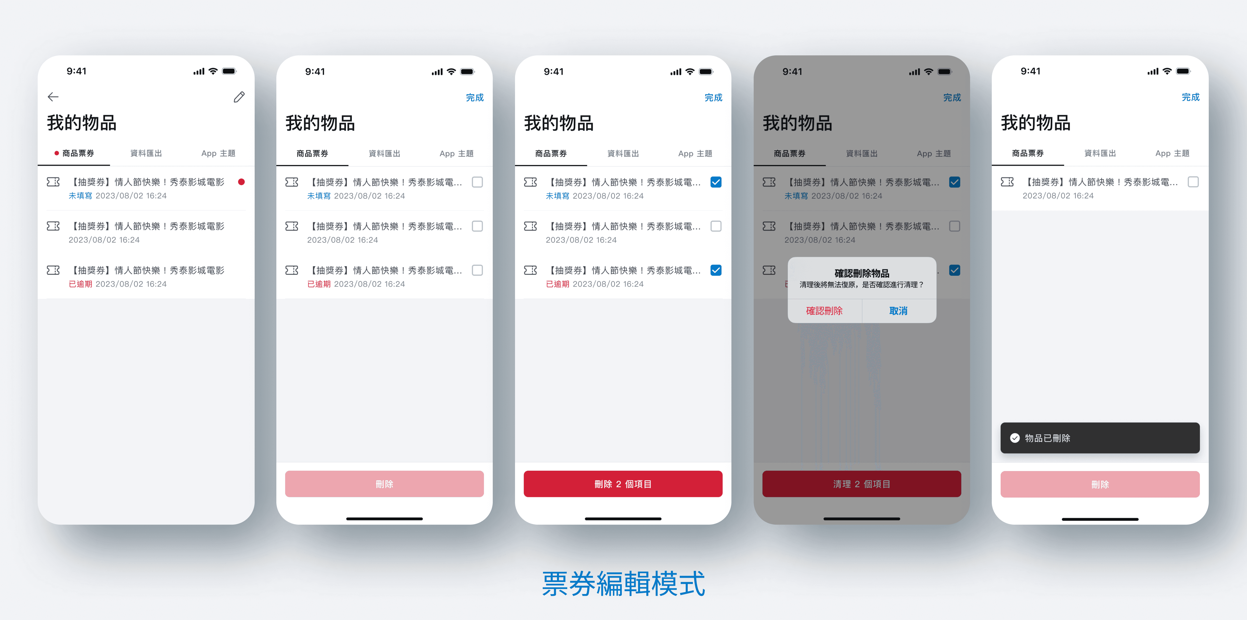
My items / Concept restructuring
The UI of the gift box inner page still remains in the version from a few years ago, and this time it will be optimized along with the version update. The image of the gift box is inconsistent with the items the user already possesses, which can easily cause confusion. After discussions with the internal team, the "gift box" has been renamed to "My Items," and the gift box has been changed to a backpack icon to emphasize that it is an item already owned by the user. There has also been feedback from users that there are a large number of overdue tasks in the gift box, and once the information becomes more, it becomes difficult to find the information they are looking for. This version has also added an edit mode for users to delete overdue data.
Daily check-in moving
Daily sign-ins have always been the task with the highest invoice conversion rate. Many users log into the app daily to complete tasks for the sake of earning coins. However, backend data also shows that the conversion rates of tasks that are further down the order decrease exponentially, and the task conversion rates are directly tied to revenue. Therefore, it's imperative to readjust the daily task layout. The initial plan is to make it a standalone functional area, increasing the flexibility for future extensions. At the same time, to increase the exposure of the mall page, the first version attempts to move the daily sign-in to the mall page and observe whether it can help improve the total views and conversion rates of the mall page.

Get in Touch
hugohsu0401@gmail.com
© Hugo Hsu 2023 Copyright. All Rights Reserved.